font choices and justifications
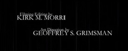
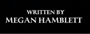
We chose to use the font "Iowan Old Style" for our opening title sequence because it's the closest font to what would be written on a grave stone. We chose it to be as close matching to a grave stone font as we could because our OTS is set in a graveyard, and is about death and supernatural beings.
We picked out three fonts that we could use for the text in our OTS that we felt matched the theme of our supernatural horror film and asked online and on social media for advice about which font is the best to use. The three fonts that we chose were:
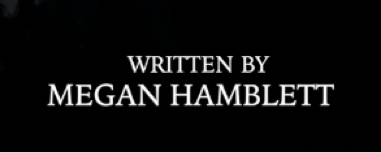
humana serif
This font was our second most popular choice. It looks bold but not very sinister. We chose not to use it as it looks too familiar and stereotypical for the genre of our film. It also doesn't look like it would be found on a gravestone, either. For example, the letter "Y" in the word "BY" looks like a flower or something else that is nice and curvy. This font wasn't what we were looking for.
kino mT
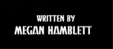
This was our least popular font choice as it is the hardest to read and it also looks like it is trying too hard to be dark and sinister. It looks like the text that you would find on children's Halloween toys which is the main reason as to why we have decided that it is best that we don't use it as we want our opening title sequence to be taken seriously and not appeal to little kids.
Iowan Old Style
This was our most popular font choice as it is bold, easy to read and looks similar, if not the same, to the font of the text that you find on most gravestones. It matches the theme of our opening title sequence so we decided that this was the most suitable font to use for it. It's simple, scary and the best font for this context.
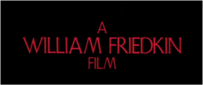
INSPIRATION
We got our inspiration from 'The Exorcist 1973' as the font choice is relatively close to what writing you would see on a gravestone. We didn't take inspiration from the font colour as we didn't think it would fit in with our theme. As a group, we thought that it wouldn't look professional enough as the majority of horror films opening title sequences font choice is white. It would also not link to our OTS as ours is based around a church and graves.
We got the majority of our inspiration from 'The Conjuring' opening title sequence because the font and colour choice fitted the best with our OTS. As said before when comparing it to 'The Exorcist 1973' we wanted our writing to look like the same font used on a gravestone. 'The Conjurings' OTS font and colour choice suits our OTS the best. We then took on the inspiration and found the font 'IOWAN OLD STYLE' .